Quick navigation
- Stories
- Events
-
Magazine
- History
- Person
- My experience
- Inspiration
- Controversies & Ethics
- Cultural perspectives
- Legal & Business
- Behind the scenes
-
Guide
- Travel Guide
- Questions & Answers
- Shop
- Forums
- Forums
-
Blogs
- All Blogs
- Create Blog
- Users
- Login


- April 14, 2023 at 2:25 PM
-
47.3K
Digital Art (Post-Processing)
The "The Cinematic Colour Grading Project" is a digital art project exploring the captivating world of color palettes in film.
I will demonstrate how strong color grading, lighting, and natural effects are used to convey mood in key scenes from iconic films. These techniques will then be applied to photographs of abandoned buildings to create a digital artwork.
This page showcases the results of digital photo processing, illustrating the "before" and "after" changes. Janine admits that these works are created purely for pleasure - late-night sessions with Photoshop allow her to bring creative ideas to life and try something new. Each of these images is her personal experiment, simple and sincere. She hopes that among these creations, there will be some that spark interest, and she is always open to new ideas, inviting viewers to share their thoughts and suggestions.
Here’s how Janine describes some of these projects:
"Alien"
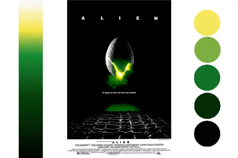
For this project, I will use the iconic movie poster. I usually use screenshots of key movies scenes, but this time I wanted to try something different. I adore lime green. Especially when bright yellow-toned greens are displayed alongside blacks. I find the colour scene used in the Alien movie poster exquisite.
I thought something futuristic looking would be a good base image for this project. Something with a circular theme might also emulate the alien egg. These two points made me certain that the best choice would be Special K, and abandoned Hungarian power plant control room.
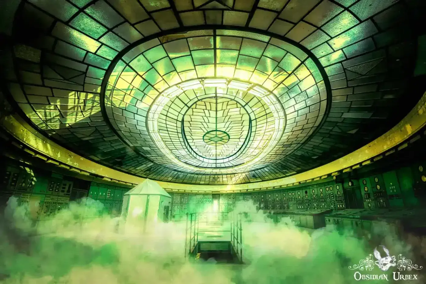
For me, the key features of the colour palette and color grading are;
- Low key. High contrast with blacked-out shadows. Amplifies the suspense, as you can’t see what is lurking in the dark.
- Prominent green, especially the mid-tones
- Highlights picked in bright yellow
- Brightest accents in white
- Some green/yellow/white fog to add to the foreboding mood
Snowpiercer
For this project, I will use one of the online promotional posters for the 2020 Netflix series. The colours and textures of this one appealed to me.

For me, the key features of the colour palette and color grading are:
- Washed-out colour palette, with high-contrast. This enforces the feelings of a bleek and harsh post-apocalyptic world
- Gritty textures, to emphasise frost clinging to every surface
- Pale blue colour cast, an obvious reference to the cold icy world
- Ice textures on the background
- Snow spray from the train, to emphasise the ever-forward movement of the engine eternal
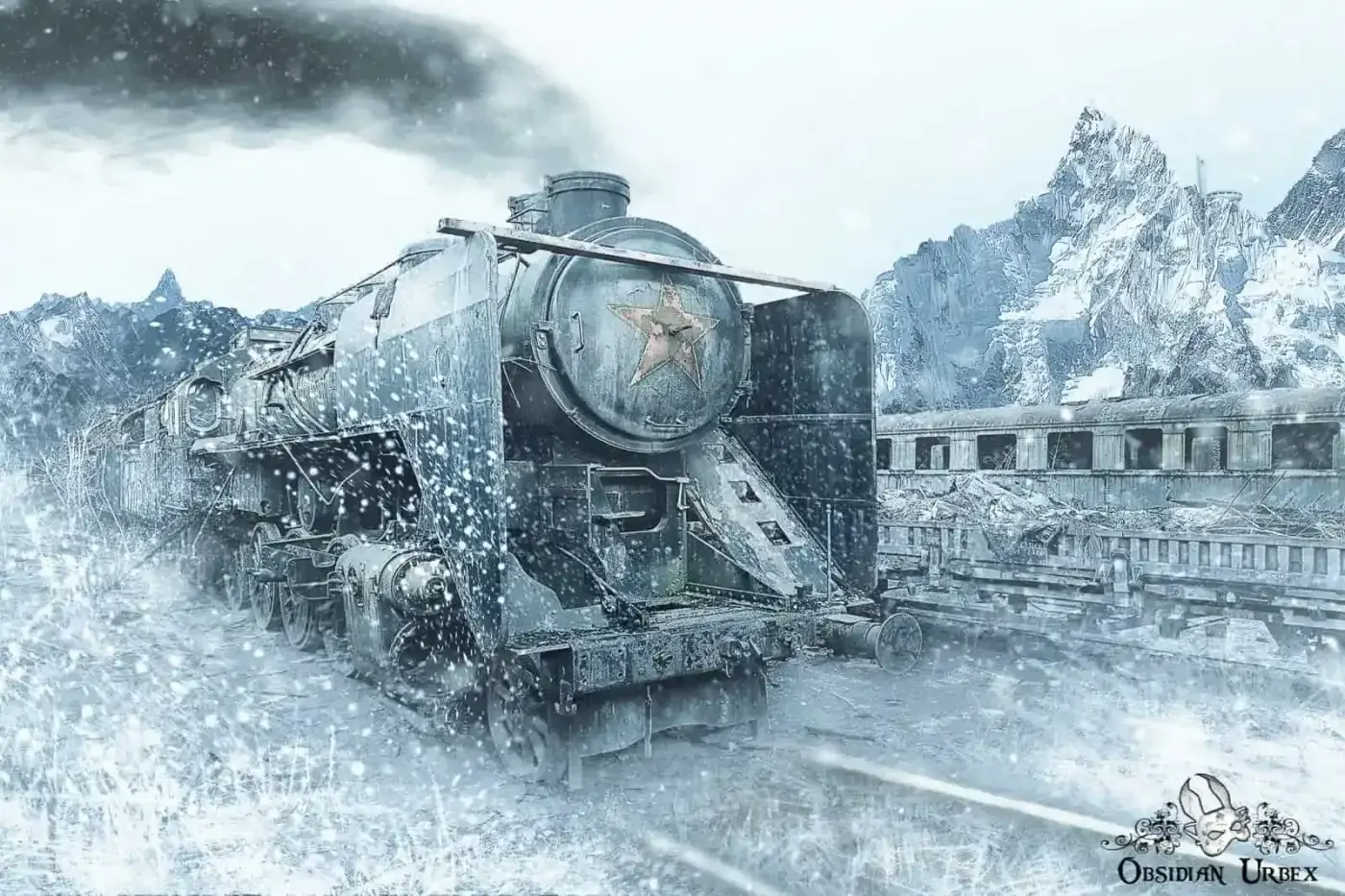
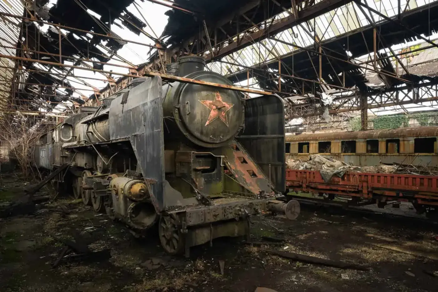
My first step was to select a train photograph from my portfolio; we can’t recreate Snowpiercer without this! I picked the Red Star Train from Hungary. Perhaps it stuck in my mind, as the red star logo on the front ties in with the WIlbur “W” on the front of Snowpiercer (at least to me!)
Bladerunner
The movie was groundbreaking in terms of its dark and gritty vision dystopian vision of future Los Angeles. Bladerunner has been widely cited as the inspiration for the Cyberpunk genre.
The cyan-tone colour scheme is one of my favourite aesthetics of this film. Typically, blue/cyan is used in cinema to covey very specific moods. These include cold, depression, isolation, technology, uncertainty, detachment or melancholy. The future depicted in Bladerunner is bleak; humanity at the brink of collapse, with dangerous replicants hidden among us.
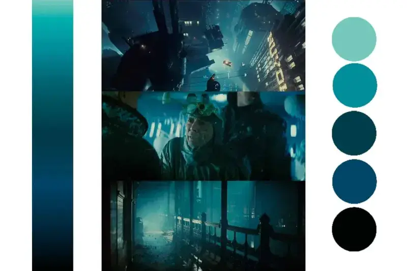
The heavily stylised visuals of Bladerunner have the following re-recurring themes:
- High contrast. This gives a Film Noir appearance.
- Backlighting. Silhouetted characters, lit strongly from behind.
- Heavy use of neon lights in city scenes. This is reminiscent of modern Tokyo and Tokyo cityscapes. This feature is a recurring theme in Cyberpunk visuals.
- Smoke and fog. The air is thick with pollution.
- Shaft lighting/light rays.
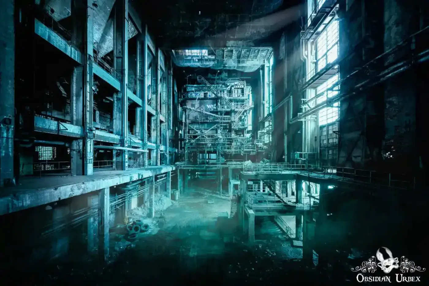
For this project, the choice of an abandoned location was clear. This power station in Hungary was a filming location for Bladerunner 2049.
Key features I have attempted to replicate:
- A strong Cyan/blue tone, applied by colour grading and re-sampling colour curves
- High contrast scene, with dark moody shadows
- Photoshop-generated light rays and smoke effects
- Strong highlights from windows to contrast the deep shadows
Mad Max : Fury Road
The digital film has been re-coloured to resemble rich/vibrant 1980s movie palettes:
- The digital film has been re-coloured to resemble rich/vibrant 1980s movie palettes.
- Reds and yellows emphasise the harshness of the desert environment.
- Desert skies are blue or blue/pink in colour, and are often vibrant
- Areas of interest are sharpened, and have more grit than the rest of the frame. This draws the focus onto the subject.
- Rapid transition/cutting between scenes. Specifically, this emphasizes the chaotic and “ever-moving” nature of the world.
- Generally, the subject is centre frame. Due to the rapid cutting between scenes, this enables the viewer to remain focused on the main subject(s).
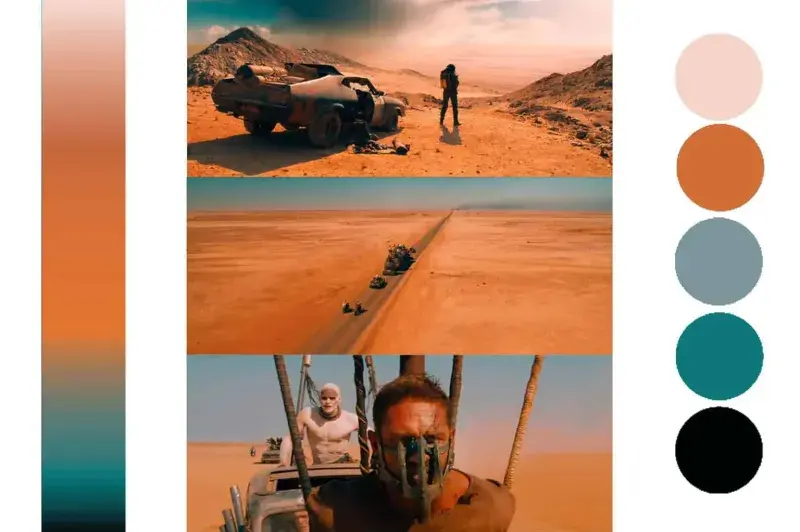
With this in mind, I decided this colour grading would require a prominent vehicle. Something to match Mad Max’s V8 Interceptor. I settled upon a 1970’s Green Mercury Cougar, a photo I took in 2018 in an American junkyard. It even has a “shiny and chrome” hub cap, befitting a popular catchphrase of the movie.
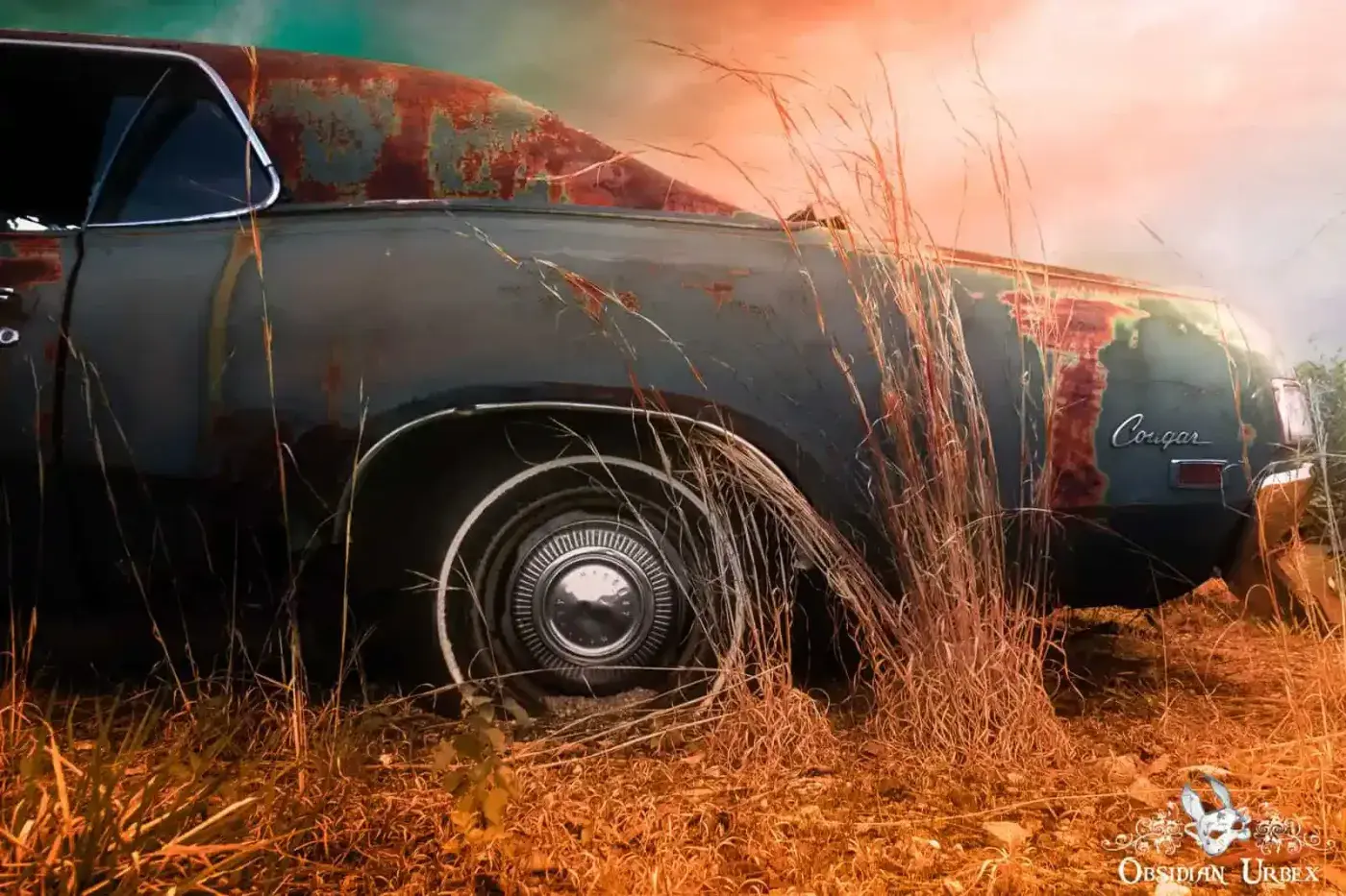
Key features from Mad Max : Fury Road I have attempted to replicate:
- Replicating the colour scheme of Mad Max’s V8 Interceptor; black paint job with rest rust.
- Orange-red desert sands.
- Bold sky, gradient from light pink to a deep aquamarine.
- Sharpened subject, with a gritty texture.
Comments